
 Perfecting Product
When we started working on color accessibility for ChartSimply we knew right away that we would face some challenges.
Designing colors for pie and donut charts sounds simple enough, but once you dive into the details, you realize that data visualization is one of the most demanding software categories for color accessibility.
Unlike most other software categories where usage of color is decided based on colors’ aesthetic appeal, emotional communication, and/or alignment with brand, data visualization requires good color accessibility and is mission critical.
To create useful data visualizations, the colors used in user interfaces must be easily identifiable, must appear significantly different from their nearest visual neighbors, and also must be easily recognized as the same colors they connect with on UI elements, such as legends and labels.
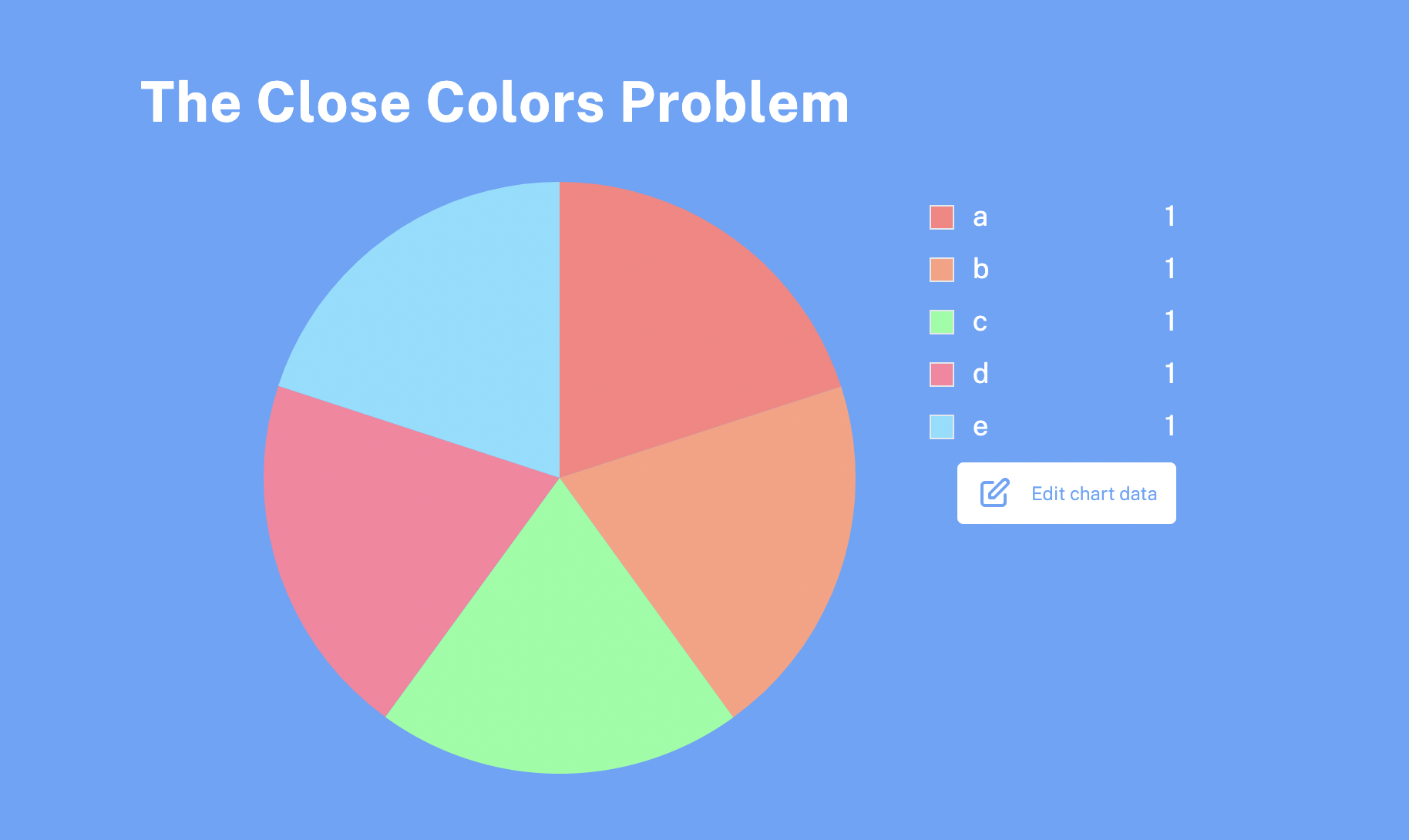
The Close Colors Problem
Colors that appear similar to each other take longer for users to differentiate.
Consider a simple example where a user creates a chart and two or more of the colors look almost the same.
While users may be able to identify differences in charts with only one or two colors in total, making out these differences amongst charts with a large number of color labels quickly becomes difficult.
The Problem With Using Random Color Hues
Random color hues, an option we explored early on, also present color accessibility issues.
This example shows how using random color hues can quickly confuse users, even when controlling for lightness and color saturation.
In this example shown below, the chart colors were generated at random each time a new label was added.
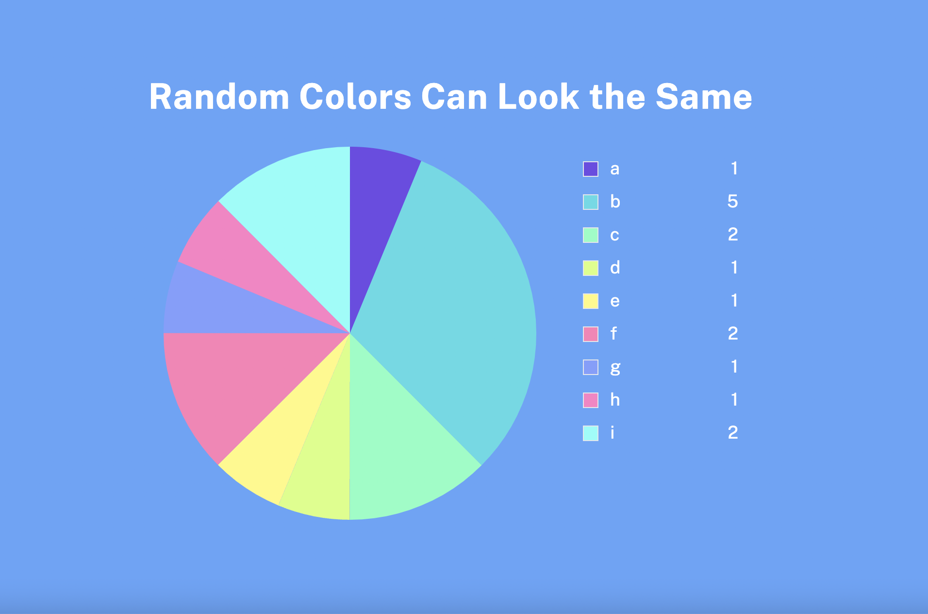
Labels for F and H appear the same, making it difficult for any user to make out and identify which one corresponds to the right piece of data.
Color closeness is like the birthday problem. There’s a higher than perceived likelihood that two colors will be similar enough to confuse users.
In pie and donut charts, having two chart labels or more with hues closer than 15 degrees to each other presents problems.
Balancing for Color Saturation and Eye Strain
Highly saturated colors can be exhausting to look at, but if you reduce color saturation too much, the colors become muddy and they’re hard to distinguish.
Here you can see high color saturation color palettes next to a lower color saturation color palette and one that is perceptually neutral.
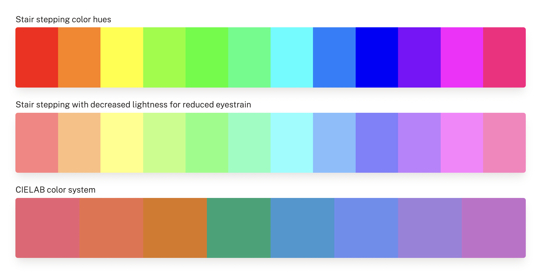
While the color palette on the bottom offers even perceived brightness and color saturation, its colors are not easy to differentiate, so we avoid using it.
Creating Useful Color Variation While Avoiding Key Tradeoffs
After identifying some key problems in color accessibility, we were left with few options to choose from.
This gave us a set of useful constraints that allowed us to generate dynamic color palettes without confusing users or locking users into the colors we choose.
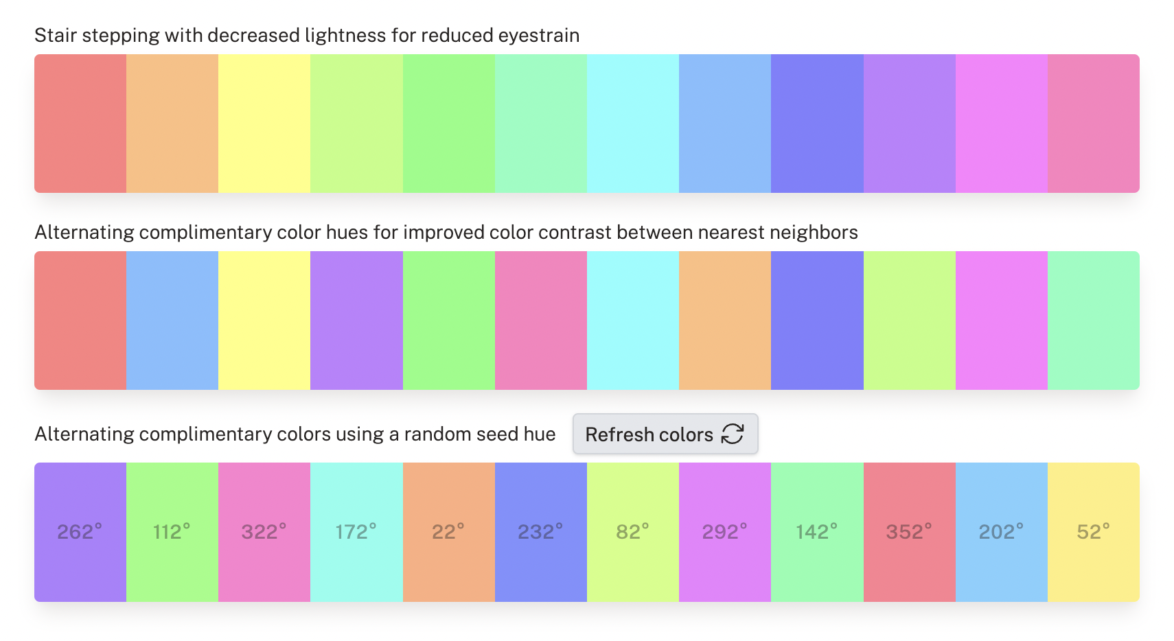
By maximizing the difference in hues between each color step, we deliver strong color contrast out of the box.
By randomizing the seed hue, we deliver strong color variation that ensures that each chart doesn’t look the same.
Lastly, by enabling users to choose colors when editing their charts by clicking on the color labels, we give users an option to select whichever colors feel right for them.